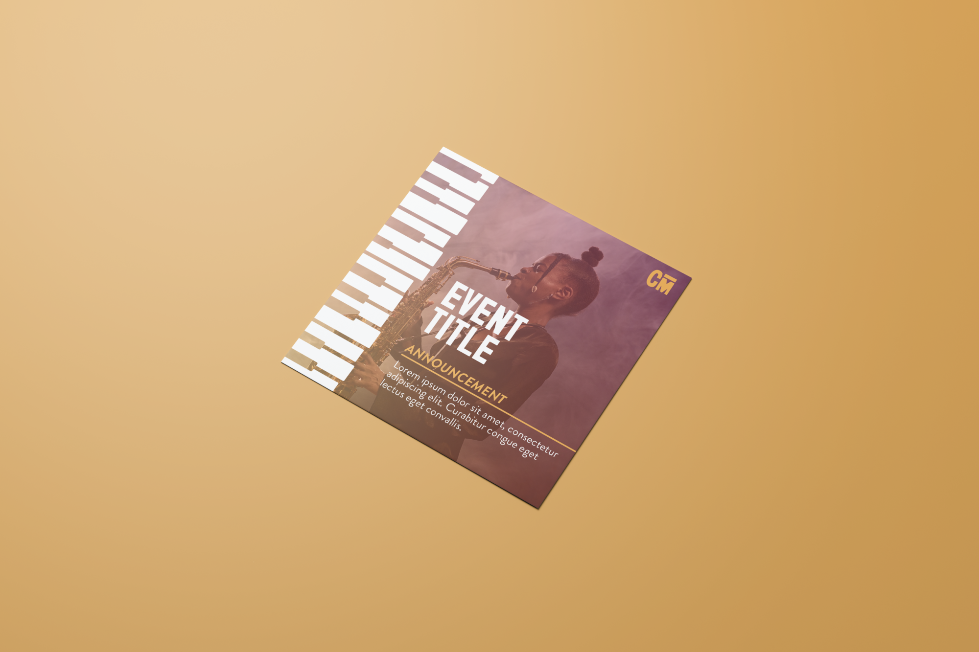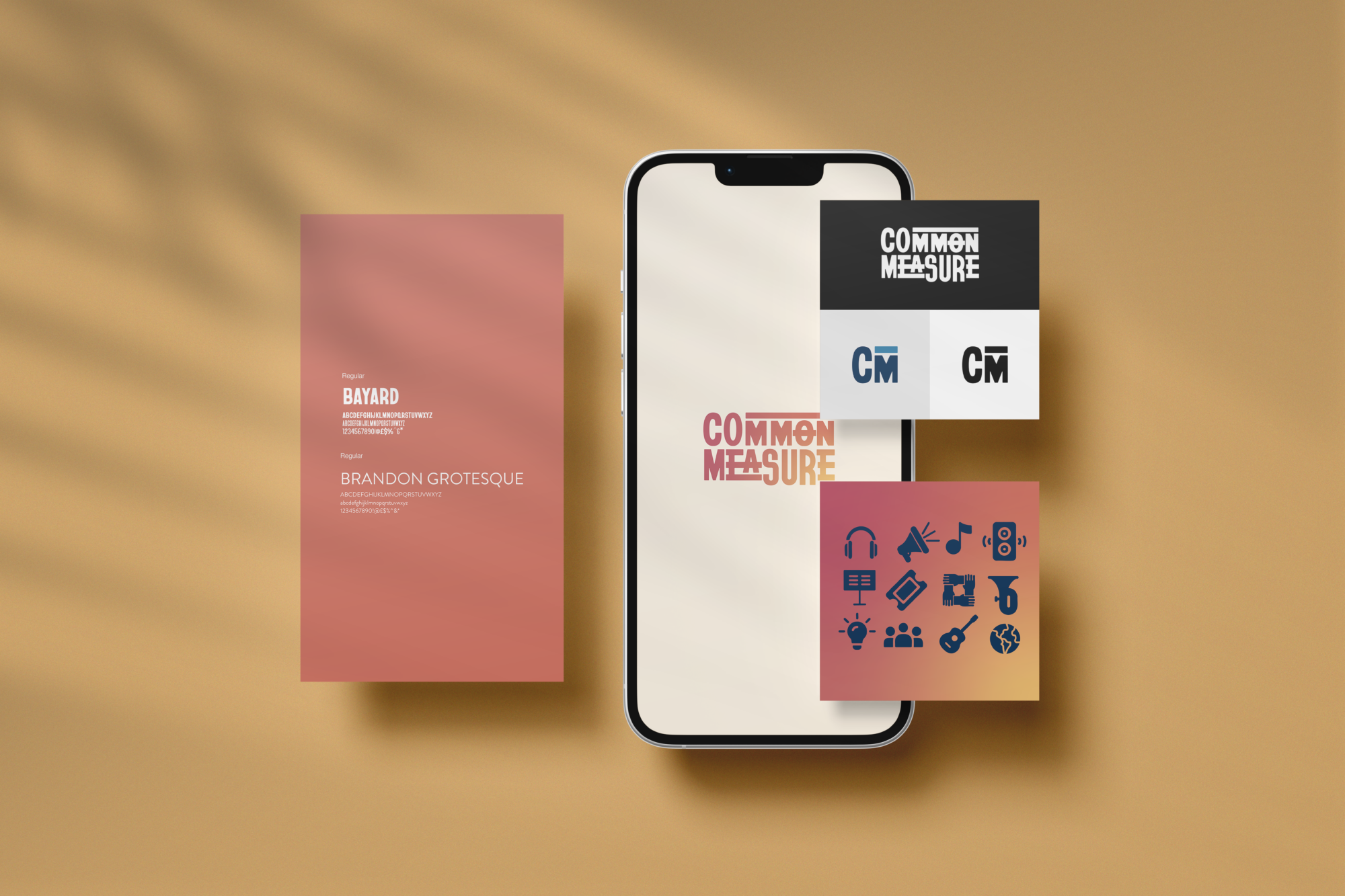
Common Measure Organizational Branding
Common Measure (formerly known as the Harry T. Burleigh Society) wanted to rebrand to reflect the changes happening in the organization. The identity mark was designed to symbolize visual musical notation and the poetic structure of a common measure, reflecting the work of Harry T. Burleigh. It features five crossbars intersecting the organization’s name. The chosen typeface, Bayard, was selected for its historical significance, drawing inspiration from the 1963 March on Washington for jobs and freedom. This choice aligns with the organization’s mission to foster an inclusive environment that amplifies talent, celebrates diversity, and promotes the study, creation, and performance of music.
About the Design
The identity mark was designed to symbolize visual musical notation and the poetic structure of a common measure, reflecting the work of Harry T. Burleigh. It features five crossbars intersecting the organization’s name. The chosen typeface, Bayard, was selected for its historical significance, drawing inspiration from the 1963 March on Washington for jobs and freedom. This choice aligns with the organization’s mission to foster an inclusive environment that amplifies talent, celebrates diversity, and promotes the study, creation, and performance of music.